Citypak Case Study
The Citypak Project is a non-profit organization that provides safe, convenient and versatile backpacks uniquely designed to meet the needs of the homeless. I have been helping design and build the website for over a year.
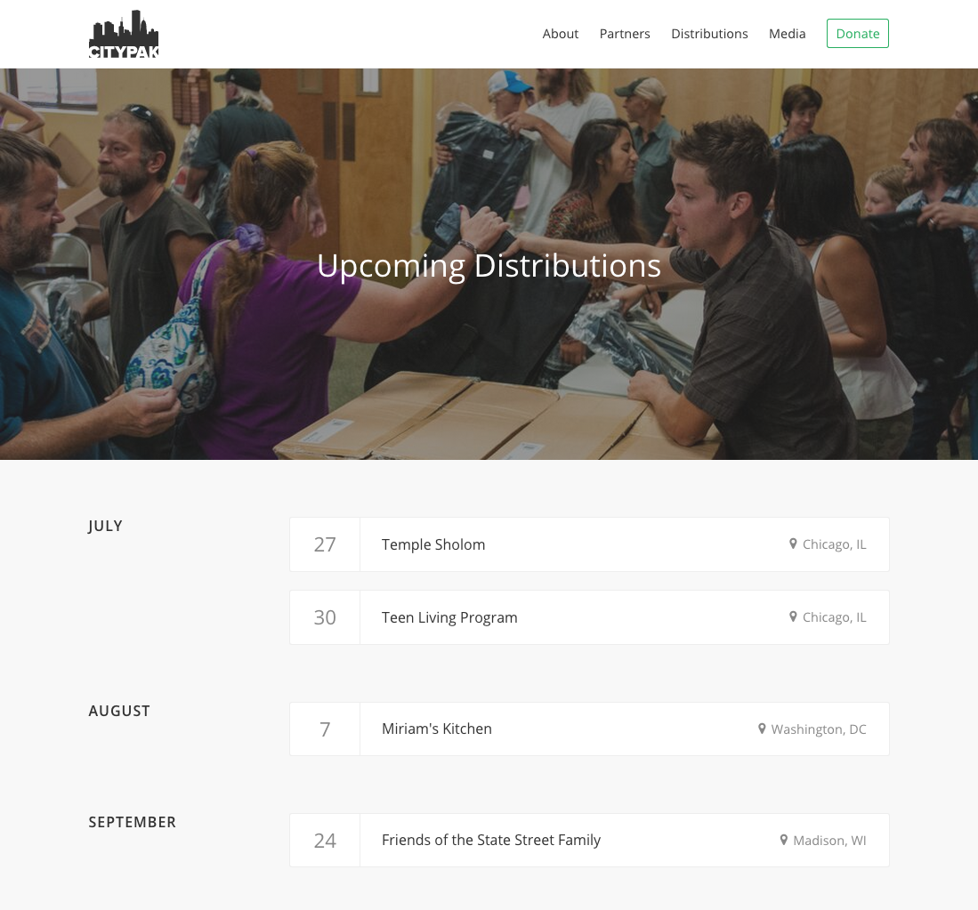
Recently, I shipped the new distributions page that allows users to see upcoming distributions.
Goals
The site was great for explaining the project’s goals and the design of the backpacks themselves, but there was no way for users or potential partners to see the upcoming distributions. It really boiled down to two design criteria for sharing information about distributions:
- Share more information about upcoming distributions.
- Encourage potential users to get involved by donating or applying for a distribution.
Solution
I liked the idea of keeping everything to a single page with a simple list. I started with some quick concepts in Sketch and landed on the concept of a card for each distribution. Each card would group the day, partner, location, and city. In terms of design, I utilized a border to visually group the information while still separating the cards from one another. The distribution date is also emphasized with a border on the right.
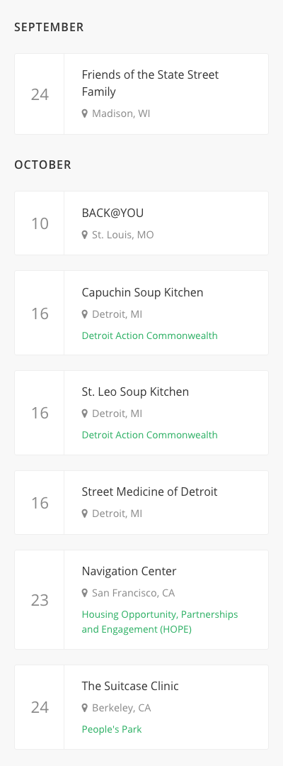
For a larger screen, I decided to go with a two column layout, with the month on the left and the distribution information on the right. Whitespace felt like an appropriate visual separation between each month.
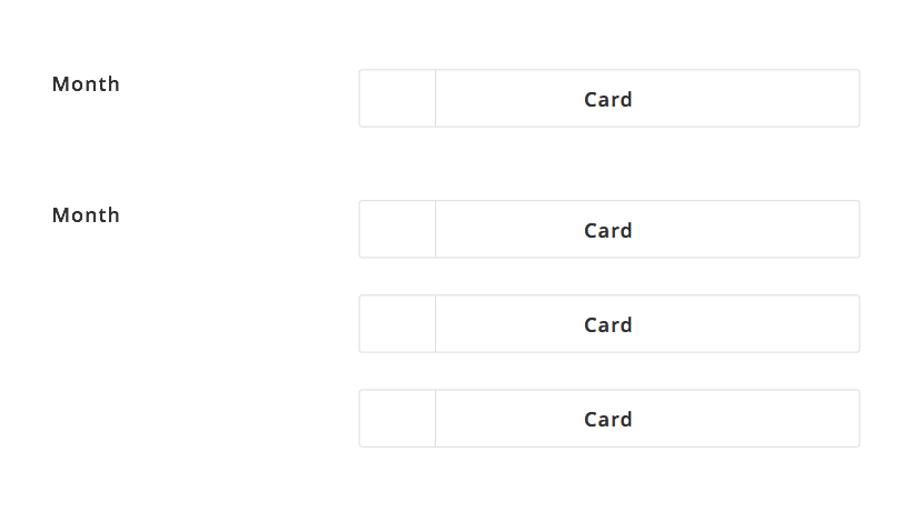
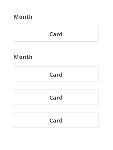
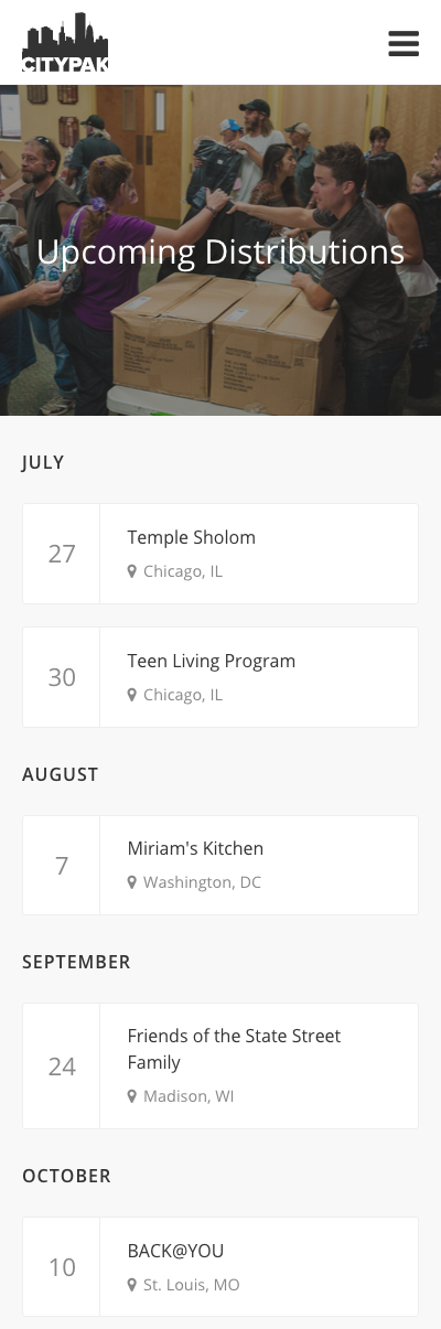
On smaller screens, the distribution list collapses to save space. I also tightened up the margins between each month to avoid an overly-empty layout.
Designing in the Browser
From here I went straight to coding. I feel it’s always best get my design into the browser as early as possible, as it gives me a sense of what works and what does not in code. This also gives me the flexibility to solicit feedback from others by taking screenshots or deploying to a live staging server.
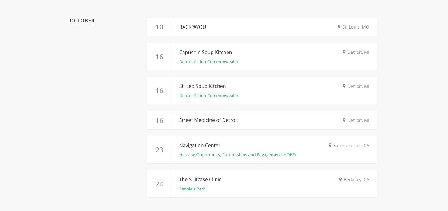
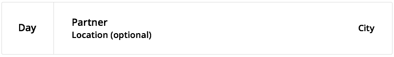
I realized I needed to help the information cards stand out and added a subtle gray background to achieve this. To create a clear hierarchy, I adjusted the typography to match the size of each piece of information and made the day the largest element, followed by the partner.
I added a location pin icon next to the city to make the information easier to skim. For the optional locations for each distribution, I used green, Citypak’s primary action color, for the links in order to maintain a consistent design language with the rest of the website.
Markup
When writing HTML/CSS, I tend to use BEM for meaningful class names. I’ve found that this methodology yields code that my co-workers find easy to read and find. In this case, the main structure became a simple list with elements for the month of the distribution and the location/partner information card:
<ul class="distribution">
  <li class="distribution__item">
    <div class="distribution__group distribution__group--month"></div>
    <div class="distribution__group distribution__group--card"></div>
  </li>
</ul>
Mobile First
I built Citypak mobile first, which helped to simplify developing a responsive layout. I started with mobile styles and layered on styles optimized for larger screens as needed. In other words, my mobile styles become the default and I can avoid overriding them later.
I also nest my media queries, rather than putting them at the end of the stylesheet or in a separate document. On larger screens, for example, I add floats and widths to the groups:
.distribution__group {
  @media #{$medium} {
    float: left;

    &.distribution__group--month { width: 25%; }
    &.distribution__group--card { width: 75%; }
  }
}

.distribution__group--month {
  margin-bottom: 1rem;

  @media #{$medium} {
    margin-bottom: 0;
  }
}
Cards
Each distribution information card is consists of three main components: the information card (card), the distribution date (card__date), and the card’s container (card__container).
I used flexbox to make it simpler to vertically align the contents of the card elements. It’s a wonderful property because the content inside the card will stay vertically centered regardless of the amount of displayed information. Unfortunately, flexbox requires many vendor prefixes. To solve this, I opted to add autoprefixer which automatically adds vendor prefixes to styles so I don’t have to; very convienient!
<div class="card">
  <div class="card__date"></div>
  <div class="card__container">
    <div class="card__header">
      <a class="card__title" href="" target="_blank"></a>
      <p class="card__location"></p>
    </div>
  </div>
</div>
.card {
background: $white;
border-radius: $border-radius;
border: 1px solid $border-color;
display: flex;
margin-bottom: 1.3rem;
&:last-of-type { margin-bottom: 0; }
}
.card__date {
align-items: center;
border-right: 1px solid $border-color;
color: $gray;
display: flex;
font-size: 1.4rem;
justify-content: center;
margin-bottom: 0;
width: 90px;
}
.card__container {
padding: 1.1rem 1.5rem;
width: 100%;
}Call to Action
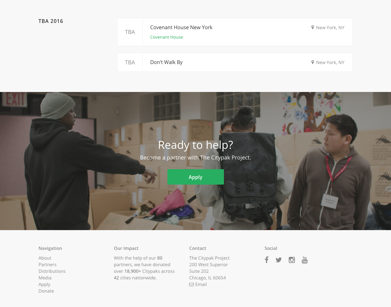
Finally, I designed a clear call to action button that makes it easy to apply from the distributions page. I wanted users to have easy access to upcoming distribution information, so I decided to place the call to action at the bottom of the page.
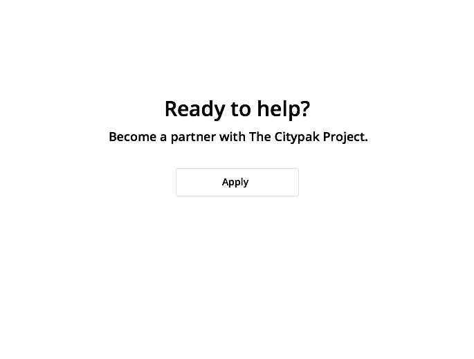
Large images bring a touch of humanity and color to an otherwise text-heavy layout. The images I chose to use in the call to action were taken during recent distribution events. I was lucky to have such easy access to some fantastic photography:
Closing
I’m really happy with how the distributions page turned out. There is still some development and design work around distributions, like removing and archiving outdated distributions from the admin pages, so this is a work-in-progress overall.
Thanks for reading!