Personal Branding
May 9, 2013
A logo can embody a unique identity that can help promote you and your brand by making it easily recognizable.
What, exactly, is a logo?
A logo is a graphic mark or emblem commonly used by commercial enterprises, organizations and even individuals to aid and promote instant public recognition.
Logos can come in many forms. Some are purely graphic (symbols/icons), while others are typographic (a logotype or word mark).
My Assignment
My assignment for the week was to do some personal branding and spruce up my blog. To start, I added a navigation to split up my blog and project pages and added a new biography that uses CSS animations (mostly for fun!).
I realized I needed a logo to replace my existing “AK” initials. This post will cover some of the experiences and lessons I learned along the way!
Plan (Grow Your Ideas)
It is really important to think through your ideas before you even pick up a piece of paper or open your laptop. After you’ve had time to think through and mature your idea, start sketching and playing with it a bit. Let this be the time to really think outside of the box! Use a piece of paper or a whiteboard to quickly get your ideas out. Only move to Illustrator once you’re ready to refine your idea and create a more finished logo.
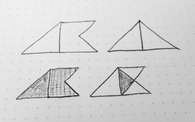
Lately, I have been spending a little more time in the planning stage and I’ve found that my work is better for it. I had a simple idea for my logo, but I let the idea mature for awhile before I created anything.
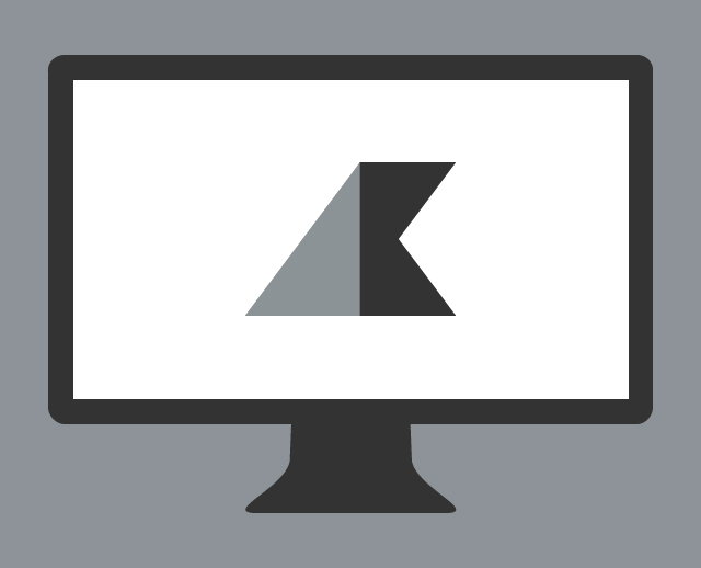
The concept for my logo was simple; replace my initials “AK” with something less typographical. I still wanted it to be about my name, so I started with shapes that mimic a slanted “A” and “K”.
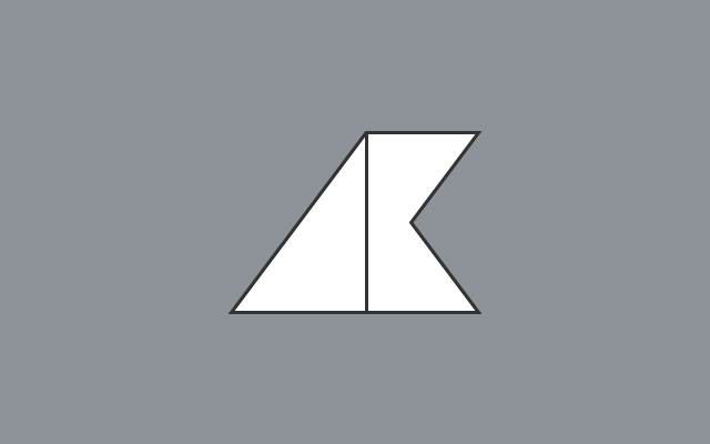
I wanted something unique that would represent my personality, a mark that could grow with me over time and help identify me as a designer. Before going further, I got feedback from the other designers. With comments like, “it kinda looks like a wave,” or “paper airplane.” I liked the fact that it was a little open to interpretation.
Experiment with Color
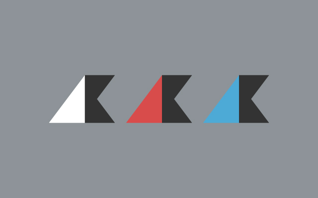
For my logo, the silhouette was extremely important. I tried some colors, including the red from my blog and a shade of blue I really liked. In the end, I went with the gray because I felt it made the header less obtrusive. I wanted it to be part of the page, not overpowering it.
Size Matters
It’s important to consider how scalable your logo is. Ask yourself how well will it hold up on mobile, or on a giant billboard. Lots of detail can get lost as the pixels shrink and your logo can become unrecognizable.
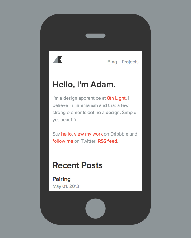
I did some quick testing and the logo I went with was easily recognizable on mobile devices, where space is at a premium. Because I was able to scale it down, I gave myself room to add more navigation items to my blog if needed.
Take Risks
Lastly, don’t be afraid to take some risks! You need to stand out among the crowd and a unique logo can help immensely. Logo design is new to me, so it was a fun and very rewarding experience, but I still have a lot to learn. I’m really happy with how my logo turned out, but I plan on iterating on it more in the future.