Navigations
July 7, 2013
Having a clear, easy-to-use navigation is essential to good web design. A navigation is often one of the most useful parts of your website, so it’s really important to get it right. Having too many navigation items can overload the user and take up too much screen real estate, especially on mobile devices.
What makes a good navigation?
There are a couple of rules I keep in mind when designing navigations:
- Make it easy to find. Placement is really important. Put your navigation in a prominent, intuitive place and make sure it stands out.
- Don’t distract from your content. Don’t be afraid to hide your navigation when it’s not necessary!
- Only include the most important links. Decide what really needs to go in your navigation and what might be better placed in the footer or a sub-navigation.
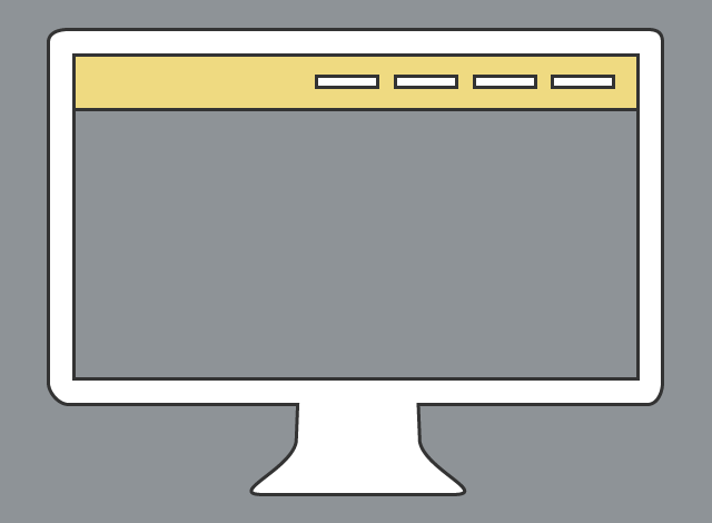
Desktop
With larger screens, the additional real estate allows for larger navigations or even items in a sidebar. Creating an inline, or horizontal, list is pretty standard. I like to use light, subtle colors on the links themselves and go bolder for the background color to provide contrast between the navigation and the content.
Some sites present articles above the navigation, but as you scroll down, the navigation becomes fixed. This keeps the navigation accessible so the user doesn’t have to scroll all the way back to the top, especially if they are using infinite scrolling for their content. Keep in mind, however, that you want to keep the navigation accessible but not overwhelming to the user.
Mobile
Once you get down to mobile sizes, you can run into other kinds of issues. Keeping your list inline, or horizontal, will break the layout and shove half of your content off screen. I find you can have a few navigation items if you make the font size smaller, but once you try to fit in too much, there’s just not enough room. It’s also not an ideal user experience, because you have to shrink the clickable area, rendering it unusable for touch devices.
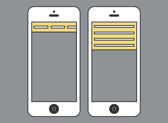
Using block elements is better, since there will be a larger clickable area and the links stack on top of one another, making room for all your items. This, however, takes up precious real estate and delays the user from reaching the most important part of your website, the content. To solve this issue, I ended up getting help from Rylan, one of the Software Craftsmen at 8th Light.
Toggle Navigation
Using jQuery and some simple CSS, Rylan and I were able to get the best of both worlds. I gain back my precious real estate on mobile while keeping the usability of block level links. Simply awesome!
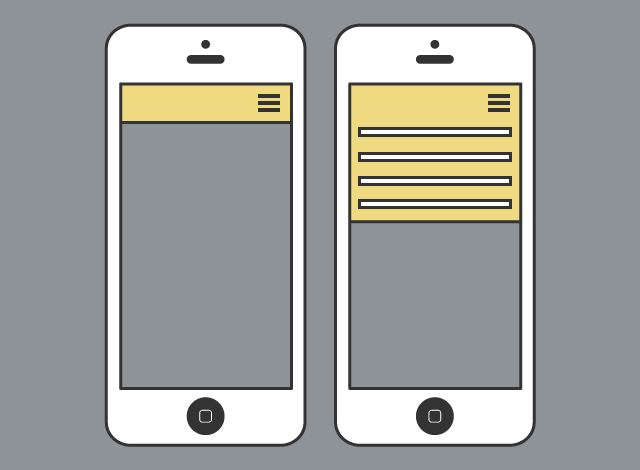
I hide the navigation items and present a widely-used “menu” icon, a “three line” symbol. Jordan Moore wrote a great article all about it in The Semantic, Responsive Navicon for Smashing Magazine:
Part of its power lies in its versatility, as the icon itself doesn’t clearly represent a precise object nor method, which means it can be applied to a variety of navigation-based design patterns without showing a preference to a particular pattern.
This icon is used everywhere; you can find it on Facebook and YouTube and even applications like Google Chrome. You just click or tap once on the “menu” icon to toggle the navigation items. This gives users the ability to easily control their experience and show the navigation only when they want to see it.
Conclusion
You can take this concept even further. Along with presenting the “menu” icon on mobile devices, MailChimp does a good job of keeping the navigation out of the way. On desktop, they hide the navigation when you scroll down but when you scroll up shows it again. This is an effective design decision that puts the site’s content first.