Color Theory
April 5, 2013
Color is a great way to make your website beautiful while enhancing its usability.
Color plays an important role in design in general. However, you have to be more mindful of color when you use it on the web, as there are a lot of usability problems that can arise from its misuse.
I won’t get too scientific, as I want to keep this relevant to web design. Let’s go over some of the basics of color theory.
Color theory is a body of practical guidance to color mixing and the visual effects of specific color combination.
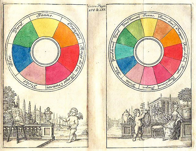
The Color Wheel
In 1666, Sir Isaac Newton developed the first circular diagram of colors. The color wheel, based on red, yellow and blue, is still the basis for most color theory.
There are 3 important sections of the color wheel:
- Primary Colors are sets of colors (red, yellow and blue) that can be combined to make a useful range of colors. All other colors are derived from these 3 hues.
- Secondary Colors are made by mixing two primary colors in a given color space and include colors like green, orange and purple.
- Tertiary Colors are made by mixing either a primary color with a secondary color or two secondary colors. Some examples include yellow-orange, red-orange, red-purple and blue-purple.
Choosing Colors
Choosing colors is extremely important and worth the effort to consider them carefully. Colors carry different meanings around the world.
Red is the color of fire and blood, so it is associated with energy, war, danger, strength, power, and determination. It can also represent passion, desire, and love.
Red also symbolizes prosperity and happiness in China, and mourning in South Africa. Red is used in many US-based AIDS awareness campaigns in Africa. Just remember that your audience may interperet colors differently.
Blue is the color of the sky and sea. It is often associated with depth and stability. It symbolizes trust, loyalty, wisdom, confidence, intelligence, faith and truth.
In India, blue is assocated with the Hindu deity Krishna, and is considered a holy color in Judiasm. The 8th Light logo uses a darker, subdued blue. It’s a smart choice, considering blue is one of the safest colors to use internationally.
While there are no set rules when selecting colors, it’s important to be mindful of your choices. Do some research! For further reading, I suggest reading Cameron Chapman’s wonderful article on Color Theory for Designers: The Meaning of Color.
Here is her quick reference guide for some common meanings of color that I find really helpful:
- Red: Passion, Love, Anger
- Orange: Energy, Happiness, Vitality
- Yellow: Happiness, Hope, Deceit
- Green: New Beginnings, Abundance, Nature
- Blue: Calm, Responsible, Sadness
- Purple: Creativity, Royalty, Wealth
- Black: Mystery, Elegance, Evil
- Gray: Moody, Conservative, Formality
- White: Purity, Cleanliness, Virtue
- Brown: Nature, Wholesomeness, Dependability
- Tan or Beige: Conservative, Piety, Dull
- Cream or Ivory: Calm, Elegant, Purity
Using Color in Web Design
Color can be a great tool to enhance user experience and improve usability. Using color for links and buttons is a great way to communicate to the user that an action is available. Links should be obvious and clearly defined or the user might miss them entirely. For this reason, I typically use bright colors, like red, green, purple or orange, for links.
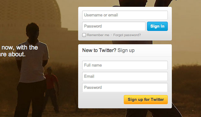
For buttons, you can use colors like green, blue and orange for submitting and saving. They stand out more and help the user navigate the page more easily. Take Twitter’s sign up page, for example:
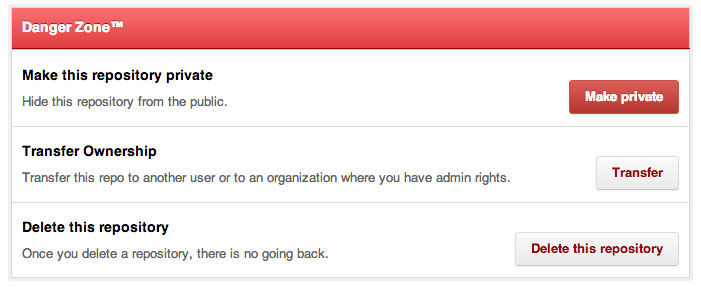
Colors like red and gray can be used for deleting, closing and archiving. Red is often assoicated with actions with repercussions, like the admin section of a Github repository:
There isn’t a right or wrong answer here. I have seen plenty of websites break the rules and still work. The point is to stay consistent so the user can easily recognize what color is associated with what action.
Color Tools
There are a lot of great resources to help you pick color palettes. I use these all the time for inspiration and to help me find matching or complimentary colors:
- Canva has everything you need to know about colors.
- 0 to 255 is a simple tool that helps web designers find variations of any color.
- Adobe’s Kuler is a design resource of exploring, creating and sharing color themes.
- COLOURlovers is a website with a big community of users who create and share color palettes, much like Kuler.
- ColorHexa is an online resource that’s useful for finding different color variations and complimentary colors. I will often search for hex colors (e.g. #b1e1ed) to experiment with different shades.
- PLTTS makes it’s easy to find matching color-palettes for your project.
- Blendoku is puzzle game that will challenge your ability to distinguish and arrange colors. The game is based on color principles and exercises taught in art schools around the world.
While there is a science behind color theory, it’s also very much an art. Learning to use color in your designs takes practice and a bit of innate taste. I’m still learning about and playing with color, but I really love its meanings and I’m fascinated by how easily it can change a design.